Visualizing Data
Visualizing Data
Introduction
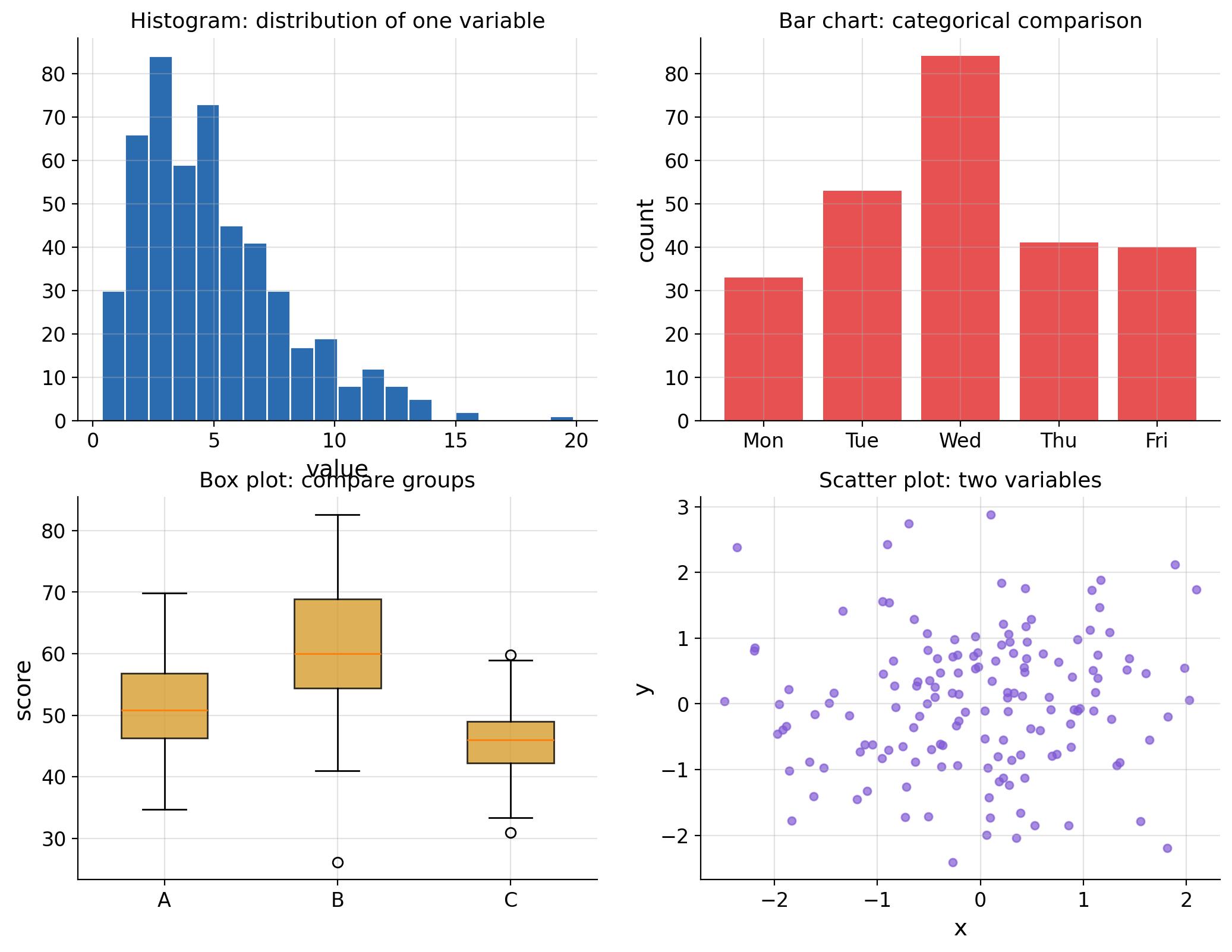
A good chart answers a question faster than a table of numbers. This lesson covers the four workhorse charts of data analysis: histograms, bar charts, box plots and scatter plots - what each is for, how to build it, and how to avoid the common traps.
Histogram: One Continuous Variable
A histogram bins a continuous variable and counts how many values fall in each bin. It shows the distribution's shape: center, spread, skewness, gaps, and outliers.
import matplotlib.pyplot as plt
import numpy as nprng = np.random.default_rng(5)
values = rng.gamma(2.4, 2, 500)
plt.hist(values, bins=20, color="#2b6cb0", edgecolor="white")
plt.title("Histogram: distribution of one variable")
plt.xlabel("value"); plt.ylabel("count")
plt.tight_layout(); plt.show()
Guidelines:
- Choose bins so the shape is visible; 15-30 bins work for most datasets.
- Too few bins hide detail; too many create noise.
Bar Chart: Categorical Comparison
A bar chart compares counts or averages across categories. The bars are separated - do not connect them.
plt.bar(["Mon", "Tue", "Wed", "Thu", "Fri"], rng.integers(30, 90, 5), color="#e53e3e", alpha=0.9)
plt.title("Bar chart: categorical comparison")
plt.ylabel("count")
plt.tight_layout(); plt.show()
Box Plot: Compare Groups
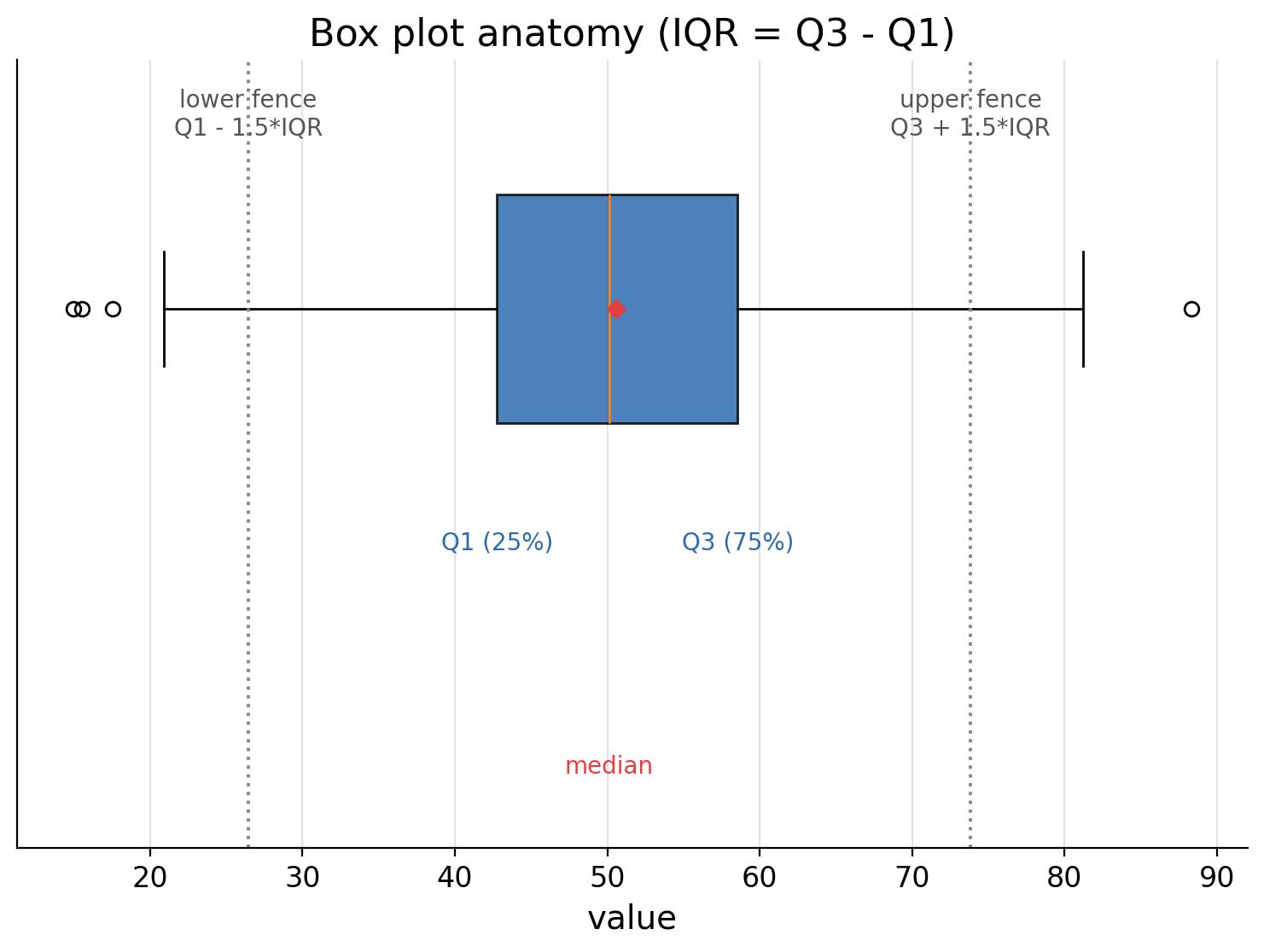
A box plot summarizes a distribution with five numbers: min (fence), Q1, median, Q3, max (fence). It is the best chart for comparing several groups side by side.
groups = [rng.normal(50, 8, 120), rng.normal(60, 12, 120), rng.normal(45, 6, 120)]
plt.boxplot(groups, tick_labels=["A", "B", "C"], patch_artist=True)
plt.title("Box plot: compare groups")
plt.ylabel("score")
plt.tight_layout(); plt.show()
Read box plots like this:
- The box spans Q1 to Q3 (the middle 50%).
- The line inside the box is the median.
- Whiskers extend to the fences (1.5 x IQR).
- Dots beyond the whiskers are potential outliers.
Scatter Plot: Two Continuous Variables
A scatter plot shows the relationship between two continuous variables: direction, strength, and shape.
x = rng.normal(0, 1, 150)
y = 0.6 * x + rng.normal(0, 0.8, 150)
plt.scatter(x, y, s=22, alpha=0.7, color="#805ad5")
plt.title("Scatter plot: two variables")
plt.xlabel("x"); plt.ylabel("y")
plt.tight_layout(); plt.show()
Which Chart When?
| Goal | Chart |
|---|---|
| Show distribution of one continuous variable | Histogram |
| Compare counts across categories | Bar chart |
| Compare groups' distributions | Box plot |
| Show relationship of two continuous variables | Scatter plot |
| Show proportions of a whole | Pie chart (use sparingly) |
| Show trend over time | Line chart |
Choosing Between Histogram and Box Plot
- Histogram: shows the full shape (skewness, gaps, multiple modes).
- Box plot: compact, great for comparing many groups, hides subtle shape.
Common Pitfalls
- Bar chart for continuous data (should be a histogram).
- Line chart for categorical, unordered data.
- 3D charts and pie charts for precise comparisons (humans read angles poorly).
- Colored charts with no legend or misleading axis starting points.
Summary
- Histogram = shape of one continuous variable.
- Bar chart = categorical comparison.
- Box plot = group comparison with robust summaries.
- Scatter plot = relationship between two continuous variables.
- Match the chart to the data type, and always label axes.
Next Lesson
Charts are great, but to reason about uncertainty you need probability. The next lesson introduces probability basics: events, rules, and the multiplication rule with conditional probability.
Quiz - Quiz - Visualizing Data
1. Best chart to show the distribution (shape) of one continuous variable:
2. Best chart to compare the distributions of several groups:
3. A scatter plot is best for:
4. A bar chart should be used for:
5. Which is a common chart mistake? multiple answers